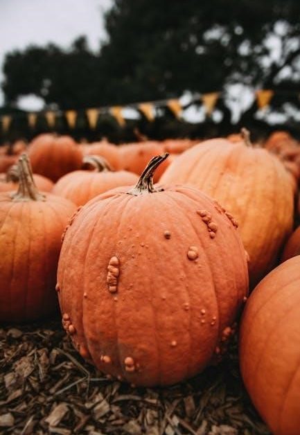
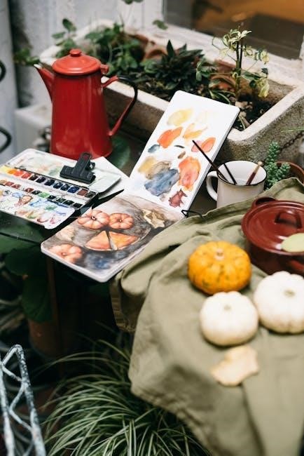
Dive into the delightful world of autumn with a watercolor pumpkin tutorial! Explore luminosity through transparent pigments, layering colors for depth, and capturing seasonal charm.
Why Paint Pumpkins with Watercolor?
Watercolor offers a unique luminosity perfect for capturing the warm glow of pumpkins. The transparency of watercolor pigments allows light to reflect through layers, creating a vibrant and realistic effect. Unlike opaque paints, watercolor’s delicate washes build depth gradually.
This medium excels at portraying the subtle variations in color and texture found on pumpkin surfaces. Finely ground pigments contribute to the paint’s coverage, and watercolor’s inherent qualities lend themselves beautifully to organic shapes and autumnal hues. It’s a wonderfully accessible and rewarding subject!
Materials You’ll Need
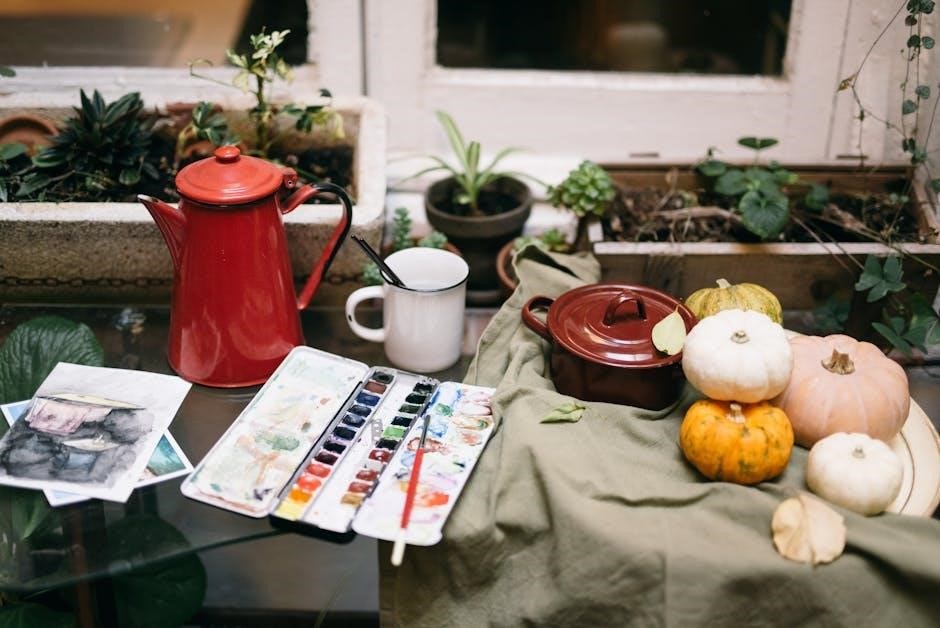
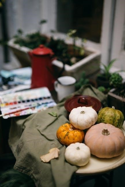
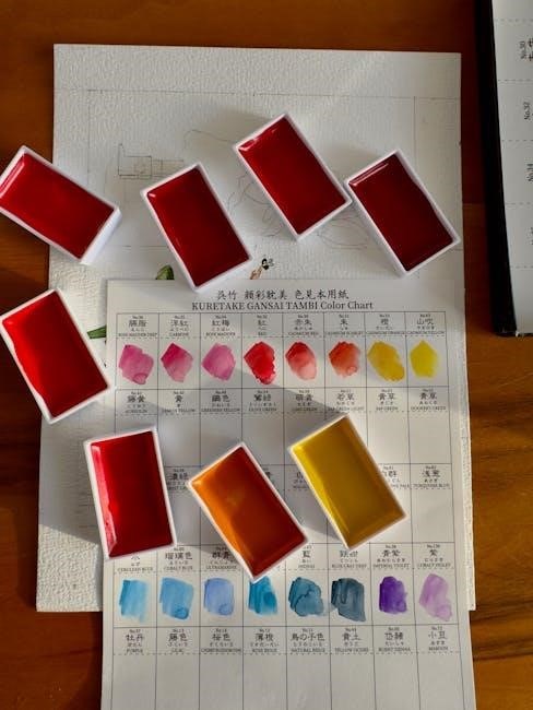
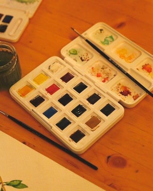
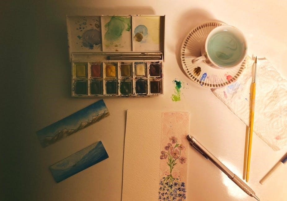
To begin your watercolor pumpkin journey, gather essential supplies! You’ll require watercolor paints – tubes or pans – in orange, yellow, brown, and green shades. Invest in quality watercolor paper; 140lb weight is recommended. Brushes of varying sizes (round and flat) are crucial for detail and washes.
A palette for mixing, a water container, paper towels, and a pencil for sketching complete the basics. Consider masking fluid for preserving highlights. Optionally, watercolor boards or masonite can serve as a sturdy surface.
Preparing Your Workspace and Paper
Establish a clean, well-lit area for painting! Choose appropriate watercolor paper, considering texture and weight, and prepare it for optimal paint adhesion.
Choosing the Right Watercolor Paper
Selecting the correct watercolor paper is crucial for successful pumpkin paintings. Consider the paper’s weight, typically measured in pounds (lbs) or grams per square meter (gsm). 140lb (300gsm) is a popular choice, resisting buckling when wet.
Different paper compositions exist – cotton, cellulose, or a blend. Cotton papers are higher quality, offering superior absorbency and durability. Explore both sides; one may have a more pronounced texture.
For detailed work, a smoother surface is preferable, while a textured surface adds character. Remember, the paper’s absorbency impacts how paint behaves, influencing blending and layering techniques.
Stretching Watercolor Paper (Optional)
Stretching watercolor paper prevents buckling and warping when applying washes, especially with larger pumpkin paintings. This process involves soaking the paper in water, then securing it to a rigid board with gummed tape.
As the paper dries, it shrinks taut, creating a smooth, stable surface. While optional, stretching is highly recommended for lighter weight papers (under 140lb). Alternatively, watercolor boards offer a pre-stretched surface.
Masonite or hardwood can also serve as a base, providing a firm support. Proper stretching ensures even paint distribution and prevents unwanted textures.
Paper Texture: Hot Press vs. Cold Press
Choosing the right paper texture impacts your watercolor pumpkin’s final look. Hot press paper boasts a smooth surface, ideal for detailed work and fine lines, showcasing intricate pumpkin ribs. However, it’s less absorbent, potentially causing paint beading.
Cold press paper features a textured surface, offering more tooth for pigment to settle into, creating granular effects; It’s more forgiving and absorbent, but details may be softer.
Consider your style; hot press for precision, cold press for a rustic, textured pumpkin aesthetic.
Basic Watercolor Techniques for Pumpkins
Master wet-on-wet for soft blends, wet-on-dry for defined shapes, and layering/glazing to build rich pumpkin hues and realistic depth!
Wet-on-Wet Technique
The wet-on-wet technique is foundational for achieving soft, blended transitions crucial for realistic pumpkin forms. Begin by applying a clear water wash to the paper where you intend to paint. Then, gently touch your brush loaded with watercolor pigment to the dampened surface.
Observe how the color blooms and spreads organically, creating subtle variations and atmospheric effects. This is ideal for establishing the initial warm underpainting and suggesting the rounded contours of the pumpkin. Control the spread by adjusting the water-to-pigment ratio and the wetness of the paper. Embrace the unpredictable nature of this technique for a natural look!
Wet-on-Dry Technique
Contrast the softness of wet-on-wet with the precision of the wet-on-dry technique. Apply watercolor pigment directly onto dry paper for sharper edges and greater control. This method excels at defining details like pumpkin ribs, stem textures, and vine intricacies.
Because watercolor paints consist of finely ground pigments, coverage varies. Layering with wet-on-dry builds intensity and allows for deliberate color placement. Be mindful of potential beading; a slightly dampened brush can help smooth application. This technique is vital for adding definition after establishing the base layers.
Layering and Glazing
Achieve depth and richness in your pumpkin painting through layering and glazing. Allow each wash to dry completely before applying the next, building color gradually. Glazing – applying thin, transparent washes – enhances luminosity and subtly shifts hues.
Transparency is key; the paper or previous layers should still show through, creating a characteristic watercolor glow. This technique allows for nuanced color mixing directly on the paper, vital for realistic pumpkin tones. Remember pigment properties affect coverage, so build slowly!
Sketching the Pumpkin
Begin with a light, simple pumpkin shape, then add the stem and vine. Keep your sketch delicate – lightly sketch details for a beautiful watercolor base.
Simple Pumpkin Shape
Start by gently outlining the pumpkin’s overall form. Don’t aim for perfection; pumpkins are wonderfully imperfect! Think of a slightly squashed sphere, or a rounded teardrop shape. Use a light hand with your pencil – you want the lines to be barely visible, as watercolor is transparent.
Avoid harsh, definitive lines. Instead, build the shape with several lighter strokes. This allows for easy adjustments and prevents the sketch from showing through the paint too strongly. Consider the pumpkin’s perspective; is it facing you directly, or at an angle? This will influence the shape you create.
Remember, this initial sketch is just a guide!
Adding the Stem and Vine
Once you have the pumpkin’s basic shape, sketch in the stem. It’s typically a short, slightly curved cylinder emerging from the top. Don’t make it perfectly straight; a little wobble adds character! Then, lightly add a vine or two curling around the pumpkin. These don’t need to be elaborate – simple, flowing lines will suffice.
Consider the direction the vine is growing; does it wrap around the pumpkin, or is it trailing downwards? Keep the vine’s lines delicate and organic. Remember to sketch lightly, maintaining the transparency needed for watercolor layering. These elements add visual interest and realism.
Lightly Sketching Details
After establishing the pumpkin’s form, begin sketching subtle details. Lightly indicate the general areas where the ribs and segments will be. Avoid harsh, defined lines; instead, use gentle curves to suggest the pumpkin’s rounded surface. These lines should be barely visible, acting as guides for your watercolor washes.
Think about the pumpkin’s natural variations – no two are perfectly symmetrical! Add a few imperfections to make it more realistic. Remember, watercolor is transparent, so heavy sketching will show through.
Painting the Base Layer
Begin with a warm underpainting using diluted orange tones. This initial wash establishes the foundation for subsequent layers, building depth and luminosity.
Choosing Pumpkin Colors
Selecting the right hues is crucial for a realistic pumpkin. Don’t limit yourself to just “orange”! Explore a spectrum – yellows, reds, and even browns contribute to authenticity. Consider mixing your own oranges to achieve unique tones.
Experiment with transparent pigments to allow underlying layers to peek through, enhancing depth. Remember, pumpkins aren’t uniformly colored; variations in tone create visual interest. Observe real pumpkins for inspiration, noting subtle shifts in color across their surface.
Warm underpainting sets the stage, influencing subsequent layers and adding luminosity.
Applying the First Wash
Begin with a light, diluted wash of your chosen base color. This establishes the overall tone and prepares the paper for subsequent layers. Use a large, soft brush for even application, working quickly to prevent harsh edges.
Tilt the paper to encourage the paint to flow and blend naturally. Remember, watercolor is transparent, so the initial wash will significantly influence the final result. Avoid overworking the paint; let it settle and dry before adding details.
This foundational layer creates a warm underpainting.
Creating a Warm Underpainting
A warm underpainting sets the stage for vibrant pumpkin hues. Utilize diluted washes of yellows, oranges, and even a touch of red to build depth. This initial layer doesn’t need to be precise; focus on establishing a general warmth and luminosity.
The transparency of watercolor allows this underpainting to subtly influence subsequent layers, creating richer, more complex colors. Let each wash dry completely before proceeding to avoid muddying the tones.
This foundational warmth enhances realism.

Developing Pumpkin Form with Value
Sculpt your pumpkin with light and shadow! Employ varying color values to define form, understanding your light source is key for realistic depth.
Adding Shadows and Highlights
Bringing dimension to your pumpkin relies on skillfully placed shadows and highlights. Observe where light strikes the form, creating areas of intense brightness and deep shade. Utilize darker oranges, browns, or even muted purples for shadows, layering them gradually to build depth.
Highlights should be reserved for areas directly facing the light source, often using a slightly lighter shade of orange or even a touch of yellow. Remember, watercolor’s transparency allows for beautiful glazing – building up layers to refine these tonal shifts.
Consider the pumpkin’s curves; highlights aren’t flat, but follow the contours of the surface.
Using Different Color Values
Mastering color values is crucial for a realistic watercolor pumpkin. Value refers to the lightness or darkness of a color, independent of its hue. Employ a range of orange values – from pale yellows to deep, almost reddish-browns – to define the pumpkin’s form.
Darker values establish shadows, while lighter values represent highlights. Subtle shifts in value create a sense of roundness and volume. Experiment with mixing colors to achieve a diverse palette of values, enhancing the pumpkin’s three-dimensionality.
Observe real pumpkins to understand these subtle variations.
Understanding Light Source
Identifying your light source is fundamental to painting realistic pumpkins. Determine where the light originates – is it direct sunlight, a soft glow, or an artificial lamp? This dictates where highlights and shadows fall, shaping the pumpkin’s form.
Consistent light direction creates believable depth. The brightest highlights appear where light directly hits the surface, while shadows reside on the opposite side.
Observe how light wraps around the curves, creating gradual transitions between values. A clear understanding of light enhances realism.
Adding Details and Texture
Bring your pumpkin to life! Define ribs, create a realistic stem, and add delicate vine details using varied brushstrokes and subtle color shifts.
Pumpkin Ribs and Segments
Defining the pumpkin’s form relies on accurately depicting its ribs and segments. Lightly sketch these divisions, observing how they curve and vary in width. Utilize a slightly darker shade of orange, mixed with a touch of brown or purple, to create subtle lines representing the recessed areas between the segments.
Remember, these aren’t harsh outlines; instead, focus on gentle washes that suggest depth. Layering is key – build up the shadows gradually to enhance the three-dimensional effect. Consider the light source; ribs facing away will be darker, while those catching the light will remain brighter, contributing to a realistic portrayal.
Creating a Realistic Stem
A convincing stem adds significant realism to your watercolor pumpkin. Begin with a base of muted browns and ochres, layering to build depth and texture. Observe real pumpkin stems – they’re rarely uniform in color. Incorporate subtle greens and grays to mimic dried or weathered areas.
Use a fine brush to suggest the stem’s rough texture, adding tiny lines and dots. Don’t be afraid to introduce shadows where the stem connects to the pumpkin, enhancing the sense of volume. A touch of darker brown can define any remaining tendrils or imperfections.
Adding Vine Details
Extend the narrative of your watercolor pumpkin with delicate vine details! Use a fine-tipped brush and a slightly diluted mix of greens and browns to sketch winding vines emerging from the pumpkin’s base. Vary the line weight to create a natural, organic feel.
Introduce subtle shadows beneath the vines where they overlap, enhancing depth. Add small leaves, employing layering techniques to suggest form and texture. Remember, vines aren’t perfectly symmetrical; embrace gentle curves and imperfections for realism.
Color Mixing for Realistic Pumpkins
Master realistic pumpkin hues! Blend oranges, yellows, and browns, adjusting values for shadows and highlights, achieving depth through nuanced color variations and transparency.
Mixing Orange Tones
Achieving vibrant and natural orange requires careful pigment combinations. Start with a yellow base, like Hansa Yellow Light, and gradually introduce a red – Quinacridone Rose offers a transparent, clean mix. Avoid opaque reds, as they can muddy the color.
Experiment with varying ratios; more yellow yields brighter oranges, while increased red creates deeper, more autumnal shades. A touch of Burnt Sienna can add warmth and earthiness, simulating realistic pumpkin tones. Remember, watercolor’s transparency allows for beautiful layering and glazing to refine your orange mixtures.
Creating Shadow Colors
Realistic shadows aren’t simply darkened orange; they possess complexity. Introduce complementary colors to neutralize the vibrancy. A touch of blue, like Ultramarine, or violet, such as Cobalt Violet, will create nuanced shadows.
Consider the light source – shadows will lean warmer or cooler depending on reflected light. Layer these shadow mixtures gradually, building depth. Transparency is key; allow underlying orange to peek through for luminosity. Experiment with Payne’s Gray for a neutral, subtle shadow tone, especially in recessed areas.
Achieving Depth with Color
Depth in watercolor pumpkins relies on layering and value shifts. Utilize glazing – applying transparent washes over dried layers – to build richness. Darker values recede, while lighter values advance, creating a three-dimensional effect.
Remember, watercolor’s transparency allows underlying colors to influence subsequent layers. Explore mixing shadow colors to subtly shift hues, enhancing form. Varying pigment concentration within washes also contributes to depth and realism, mimicking natural light and shadow.
Watercolor Pigment Properties
Understanding pigment behavior is key! Transparency creates luminosity, while granulation adds texture. Consider lightfastness for painting longevity, ensuring vibrant pumpkins endure.
Transparency in Watercolor
Transparency is a defining characteristic of watercolor, and crucial when painting pumpkins. Finely ground pigments allow light to pass through, revealing the paper or underlying layers beneath. This creates a luminous effect, vital for achieving realistic pumpkin hues and shadows.
Utilize transparent pigments to build up color gradually, layering washes to create depth and form. Observe how the paper’s texture influences the paint’s appearance, enhancing the pumpkin’s organic feel. Embrace transparency to capture the subtle glow within pumpkin shades!
Understanding Pigment Granulation
Pigment granulation refers to the settling of pigment particles within the watercolor paper’s texture, creating a speckled effect. Some pigments granulate more than others, adding visual interest and realism to your pumpkin painting. Observe how granulation can mimic the subtle variations in a pumpkin’s skin.
Experiment with granulating colors to enhance texture and depth. This technique can beautifully represent the uneven surface of a pumpkin, adding a unique artistic touch. Embrace the natural characteristics of watercolor pigments!
Lightfastness of Pigments
Lightfastness indicates a watercolor pigment’s resistance to fading over time when exposed to light. For lasting pumpkin artwork, choose pigments with high lightfastness ratings – ideally, I or II. Some traditional pigments, like certain violets, are less lightfast and may fade.
Daniel Smith offers single-pigment watercolors with good lightfastness. Prioritize quality pigments to ensure your beautiful pumpkin painting retains its vibrancy for years to come, resisting discoloration and preserving its autumnal glow.
Alternative Surfaces for Watercolor
Explore beyond traditional paper! Consider watercolor boards, masonite, or hardwood for unique textures and layering effects, offering cost-effective options for pumpkin paintings.
Using Watercolor Boards
Watercolor boards present a convenient alternative to stretching paper, especially for beginners seeking simplicity. These pre-prepared surfaces eliminate the need for taping or mounting, streamlining the painting process for your pumpkin artwork. They often feature a sturdy backing, providing excellent support and minimizing buckling.
Boards are readily available online, catering to various sheet sizes and budgets. This accessibility makes them ideal for artists starting with 10×14 inch sheets or planning larger pumpkin compositions. Choosing a quality watercolor board ensures optimal paint adhesion and prevents unwanted lifting, enhancing your painting experience.
Masonite and Hardwood as Alternatives
For a cost-effective approach, consider masonite or hardwood as painting surfaces! These materials offer a rigid support, preventing buckling and allowing for extensive layering, perfect for detailed pumpkin textures. They are significantly cheaper than traditional watercolor boards, appealing to budget-conscious artists.
However, remember that masonite and hardwood are non-absorbent. This means watercolor may bead or lift, requiring adjustments to your technique. Layering with pastels first can improve adhesion and create interesting effects, enhancing your pumpkin’s form and color.
Ampersand Pastel Primed Boards
Ampersand Pastel Primed Boards provide a wonderfully textured surface for watercolor pumpkins! These boards are specifically designed to accept layers of pastel and watercolor, offering excellent tooth and preventing buckling. While a bit pricier than masonite or hardwood, they eliminate the need for stretching paper.
The primed surface enhances pigment adhesion, reducing beading and lifting issues. This allows for richer color saturation and smoother blending, ideal for achieving realistic pumpkin hues and details. Explore layering techniques for depth!
Troubleshooting Common Issues
Address paint beading, lifting, or paper showing through! Gesso’s lower absorbency can cause issues; utilize appropriate paper or layering techniques for vibrant pumpkins.
Paint Beading and Lifting
Watercolor’s tendency to bead or lift can be frustrating, especially when aiming for smooth pumpkin surfaces. This often occurs because the paint sits on top of the paper rather than absorbing into the fibers. Acrylic gesso, being less absorbent than watercolor paper, exacerbates this issue.
To combat beading, ensure your paper is adequately prepared – stretching can help. Also, consider using a slightly warmer water temperature. Lifting happens when reactivating paint disrupts underlying layers; work quickly and avoid overworking areas. Experiment with different paper types to find one that suits your style and minimizes these challenges when painting your pumpkins!
Paper Showing Through
A common concern, particularly for beginners, is watercolor paper showing through the paint layers when creating pumpkins. This is often due to using lighter color values or insufficient layering. Some artists intentionally embrace this effect for a unique luminosity, but for a fully opaque pumpkin, it needs addressing.
Heavier weight paper (like 140lb) helps, but layering is key. Build up color gradually, allowing each wash to dry before applying the next. Using more pigment and fewer washes can also minimize transparency. Consider using a toned ground to reduce the starkness of the paper showing through.
Controlling Watercolor Flow
Watercolor’s fluidity is both a blessing and a challenge when painting pumpkins. Controlling the flow prevents unwanted blooms or washes running into unintended areas. Tilting your board allows gravity to assist, but be mindful of the direction. Use a drier brush for more controlled applications, and a wetter brush for softer blends.
Paper absorbency also plays a role; less absorbent surfaces (like gessoed boards) can cause beading. Practice controlling water-to-pigment ratios to achieve desired effects and prevent excessive spreading.
Finishing Touches and Preservation
Refine your pumpkin with final details and consider preservation! Varnishing offers protection, but alters watercolor’s luminosity; assess the trade-offs carefully for lasting beauty.
Adding Final Details
Enhance realism by revisiting key areas with subtle refinements. Gently reinforce pumpkin ribs and segments, ensuring they flow naturally with the form. Add delicate highlights where light catches the curves, creating a sense of volume.
Refine the stem’s texture, adding small imperfections and variations in tone. Consider adding tiny vines or leaves extending from the stem for extra visual interest. Don’t overwork the painting; a few well-placed details can significantly elevate the overall impression.
Step back frequently to assess the balance and harmony of the composition, making adjustments as needed to achieve a polished and captivating final result.
Protecting Your Watercolor Painting
Watercolor’s delicate nature requires careful handling and protection. Avoid direct sunlight, which can cause fading over time due to pigment properties and lightfastness variations. Consider using UV-protective glass when framing to mitigate this risk.
Handle the painting with clean, dry hands or wear cotton gloves to prevent smudging or transferring oils. Store finished pieces flat in acid-free sleeves or folders to prevent damage.
Varnishing is optional, but can offer a protective layer; however, it alters the watercolor’s appearance, so test first!
Varnishing Watercolor (Considerations)
Varnishing watercolor is debated, as it fundamentally alters the medium’s characteristics. Traditional watercolor relies on transparency and the paper’s luminosity, qualities a varnish can diminish. Acrylic varnishes are available, offering UV protection and a more even sheen, but they change the paint’s appearance.
Always test the varnish on a scrap piece of your painting first! Consider the potential for yellowing over time and the irreversible nature of the application.
Some artists prefer to leave watercolor unvarnished, embracing its inherent fragility.